

Tabs
window:CreateTab(props) adds a tab. The first visible tab opens automatically. A tab needs at least one of name or icon.
Tabs sit in a strip under the title bar by default, or in a rail down the left with sidebarLayout = true.
string
The tab label.
Select(noAnimation?), Deselect(noAnimation?), and Remove(). Pass true to select or deselect without the animation.
Sections
A section is a heading that labels the controls beneath it.CreateSection returns a handle that reorders like any element.
Sidebar sections
window:CreateSection(props) heads the tab rail the way tab:CreateSection heads an element list, grouping the tabs created after it. Same props, and the handle it returns has Remove().
The rail only exists in the sidebar layout. Under the default top strip there is nowhere to hang a heading, so
window:CreateSection does nothing there.Groups
A group arranges its children along one axis. Groups nest, so a row of columns forms a grid. Setdirection to "row" (the default) or "column"; "horizontal" and "vertical" work as aliases.
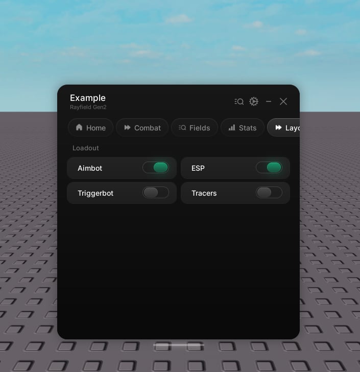
CreateSection and CreateGroup of its own.
Input, keybind, and color picker are full-width and live at the tab level. Create those directly on the tab, not inside a group.