

window:Popup(props) floats a modal card over a dimmed backdrop. Give it options for a choice dialog, or boxes for a changelog. It returns a handle with Close().
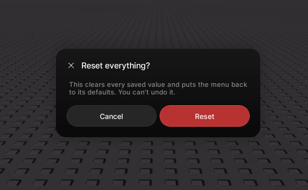
A choice dialog
A changelog
Properties
string
default:"\"Popup\""
The heading.
string
A smaller line beneath the title.
string | number
An icon beside the title.
string
A body paragraph. Wraps, and scrolls inside the card when long.
{ box }
A list of cards, shown instead of a paragraph. Each
box takes title, and optional description and icon.{ option }
default:"one dismiss button"
Footer buttons. Each
option takes text, an optional style ("neutral", "primary", or "danger"), and an optional callback that runs before the popup closes.boolean
default:"true"
Let the player click the backdrop or press Escape to close.