> ## Documentation Index
> Fetch the complete documentation index at: https://docs.sirius.menu/llms.txt
> Use this file to discover all available pages before exploring further.
# Popups
> A modal card over a dimmed backdrop. Use it for a decision or a changelog.
`window:Popup(props)` floats a modal card over a dimmed backdrop. Give it `options` for a choice dialog, or `boxes` for a changelog. It returns a handle with `Close()`.
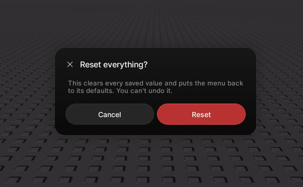 ## A choice dialog
```lua theme={null}
window:Popup({
title = "Reset everything?",
content = "This clears every saved value. You can't undo it.",
options = {
{ text = "Cancel" },
{ text = "Reset", style = "danger", callback = function() end },
},
})
```
## A changelog
```lua theme={null}
window:Popup({
title = "What's new",
subtitle = "Version 2.1",
boxes = {
{ title = "Modal popups", description = "A new centred dialog.", icon = 93364949241311 },
{ title = "Faster reveals", description = "Pages open instantly." },
},
options = { { text = "Got it", style = "primary" } },
})
```
## Properties
The heading.
A smaller line beneath the title.
An icon beside the title.
A body paragraph. Wraps, and scrolls inside the card when long.
A list of cards, shown instead of a paragraph. Each `box` takes `title`, and optional `description` and `icon`.
Footer buttons. Each `option` takes `text`, an optional `style` (`"neutral"`, `"primary"`, or `"danger"`), and an optional `callback` that runs before the popup closes.
Let the player click the backdrop or press Escape to close.
## A choice dialog
```lua theme={null}
window:Popup({
title = "Reset everything?",
content = "This clears every saved value. You can't undo it.",
options = {
{ text = "Cancel" },
{ text = "Reset", style = "danger", callback = function() end },
},
})
```
## A changelog
```lua theme={null}
window:Popup({
title = "What's new",
subtitle = "Version 2.1",
boxes = {
{ title = "Modal popups", description = "A new centred dialog.", icon = 93364949241311 },
{ title = "Faster reveals", description = "Pages open instantly." },
},
options = { { text = "Got it", style = "primary" } },
})
```
## Properties
The heading.
A smaller line beneath the title.
An icon beside the title.
A body paragraph. Wraps, and scrolls inside the card when long.
A list of cards, shown instead of a paragraph. Each `box` takes `title`, and optional `description` and `icon`.
Footer buttons. Each `option` takes `text`, an optional `style` (`"neutral"`, `"primary"`, or `"danger"`), and an optional `callback` that runs before the popup closes.
Let the player click the backdrop or press Escape to close.